
Consent
Description
The Consent screen details the purpose and use of the personal information being collected. It provides a link to the Privacy Policy of the organisation. It also contains the option to confirm consent and proceed with the onboarding process.
Default Consent screen
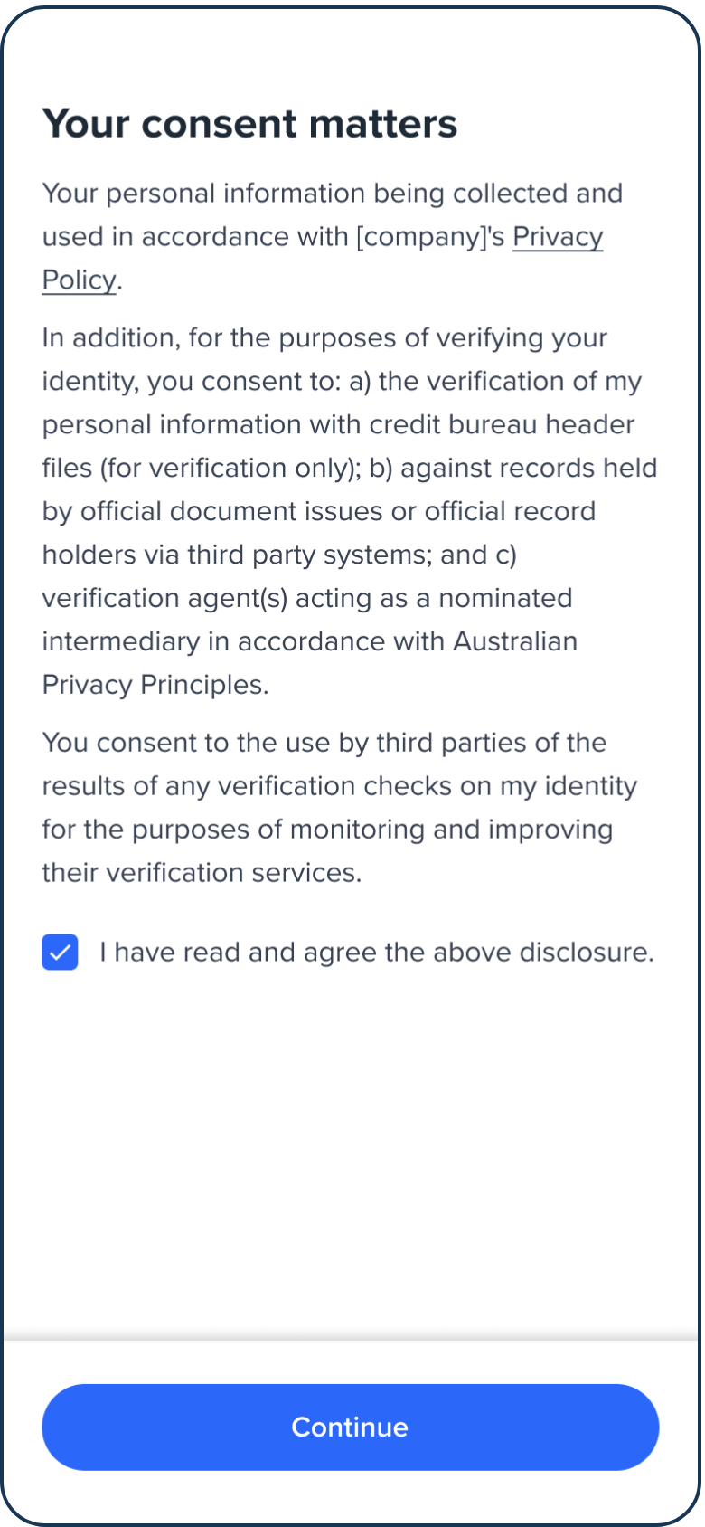
Consent screen.
Configuration
Use the following table to learn more about configuration options for the Consent screen.
| Attribute | Description | Usage |
|---|---|---|
| name | The name of the screen you want to load | name: "CONSENT" |
| type | The type of flow to be used. In this use case, it needs to be "ocr". | type: "ocr" |
| title | Title of the page. The default is "Your consent matters". - label: the title text - style: the title styling | title: {label: "<Your_TITLE>", style: {'ff-title': {}}} |
| descriptions[] | An array of labels/texts for the consent notice and guidelines to be displayed on the page. -label: string -style: ff-description | descriptions: [{label: "", style: {}}, {label: "", style: {}}] |
| checkBox | The checkbox information to be displayed at the bottom of the page. You can add an array of checkboxes. The default is: "I have read and agree to the above disclosure." -style: ff-checkbox-content: [ {-label: string} ] | content: [{label: }, {label: }]\ |
| cta | The button. -label: the button text -style: ff-button | cta: {label: "", style: {'ff-button':{backgroundColor: "red"}}} |
Sample code
const form_consent = oneSdk.component("form", {
  name: "CONSENT",
  type: "ocr",
  descriptions: [
    {
      label: 'We will verify your ID against credit bureau data sources.'
    },
    {
      label: 'Have your ID handy for verification.'
    },
  ],
  cta: {
    label: "Next"
  }
});
Events
| Event name | Description | Arguments |
|---|---|---|
| form:consent:loaded | inputInfo: {type:'ocr'} | |
| form:consent:ready | Upon clicking on the button, this event will be triggered, and you can listen to it to load another screen. | inputInfo: {type:'ocr'} |
| form:consent:failed | nputInfo: {type:'ocr'}, message?: string |
Styling customisation
You can use the following classes to customise the styling for different elements of the page. These CSS classes apply to the common elements across all the screens. If you want to customise a specific page, you can use the above configuration options to overwrite it.
| Item | CSS Class |
|---|---|
| title | ff-title |
| descriptions | ff-description |
| checkbox | ff-checkbox |
| button | ff-button |
The following code shows you how to style a specific element on the page, in this example the button's background color will be green, instead of the default blue.
<style>
    #<you_div_container> .ff-button {
      background-color: green;
    }
 </style>
Updated 5 months ago