Verifying custom documents
Learn how to configure Smart UI to request additional identity or supporting documentation as part of user onboarding.
You can configure Smart UI to verify:
- Custom identity documents.
- Custom supporting documents, such as lease agreements or utility bills.
Verifying custom identity documents
Smart UI supports the following types of identity documents:
- Passport
- Drivers License
- National ID
- National Health ID
You can also specify custom identity document types to support additional use cases not already covered by the above four types.
The FrankieOne platform assumes that each custom document has a unique number, which can be entered by the user during the onboarding process.
[
    "PASSPORT",
    "DRIVERS_LICENCE",
    {
        "type": "CUSTOM_DOC_1",
        "label": "Custom Document",
        "subtitle": ""
    }
]
Verifying supporting documents
Occasionally you may want to verify additional non-identity documents as part of your user onboarding journey. Such documents may include birth certificates, bills or bank statements.
You can request the user upload these kinds of documents as attachments during the Smart UI onboarding process, and manually verify them in the FrankieOne portal.

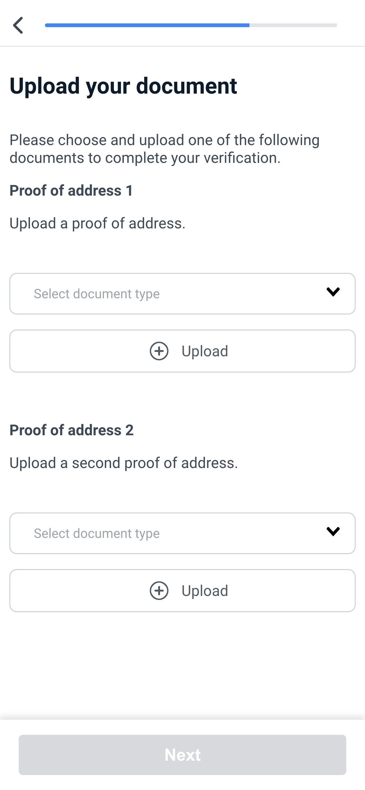
You can provide as many upload fields as you require
The user will not be able to progress until selecting type and providing an image or pdf upload, for each configured upload.
How it works
- When initialising Smart UI, you include the
documentUploadsobject in theconfigurationobject. - Smart UI inserts a step in the flow to request the configured documents as file attachments from the user.
- Smart UI uploads the file attachments to the FrankieOne platform when the user submits their information.
- FrankieOne marks the individual as Needs Attention.
- You view the supporting document file attachments in the Portal and manually verify them before determining whether the individual should be onboarded.
Configuration
You can configure
- The number of supporting documents requested.
- The allowable types of those supporting documents.
- The text displayed by Smart UI when requesting supporting documents.
The documentUploads object
documentUploads objectThe documentUploads object contains the following properties:
| Property | Required | Description |
|---|---|---|
| uploads | Required | An array of documentUploads.uploads objects. |
The documentUploads.uploads object
documentUploads.uploads objectEach documentUploads.uploads object has the following properties
| Property | Required | Description |
|---|---|---|
| title | Required | string. The label to display for the requested document. |
| description | Optional | string. Explanatory text to display for the requested document. |
| types | Required | An array of allowable document types as a string (defined here, search for "idType") or object with form: { type: string, label: string }. |
Note: type "ATTESTATION" cannot be used as a supporting document.
Customising text displayed in Smart UI for supporting documents
The text displayed by Smart UI can be customised by including the phrases.document_uploads object in the configuration object.
"document_uploads": {
  "title": "Upload document",
  "guide_text": "<div><p>Please upload 1 of the following supporting documents:<br /><br /></p><ul><li>Passport</li><li>Driver's licence</li><li>House Registration</li></ul><p>This can be either a picture or PDF document</p><div>",
  "select_placeholder": "Select Document Type",
  "upload_cta": "Next",
  "upload_success": "Uploaded",
  "generic_error": "There was an error while uploading",
  "summary_title": "Document uploaded",
  "unsupported_file_type": "Unsupported file type"
}
Will appear at the top of the Document Uploads page
- title - title of page e.g. Document Uploads
- guide_text - description at top of page, can be a string or HTML e.g.
Will appear inside the upload button
- select_placeholder - text inside the upload component e.g. “Upload file“
Will appear at the bottom of the Document Uploads page
- upload_cta - text inside the ‘Next’ button at the bottom of the page e.g. “Next”
Will appear underneath upload button
- upload_success - text that shows in green when the upload is successful e.g. “Upload Success“
- generic_error - text that displays generic file upload failure message
- unsupported_file_type - text that displays as an error if user tries to upload an unsupported file type
Will appear on review screen as the heading for the document upload section
- summary_title - text displayed as a header for the document upload on the summary screen
Example configuration
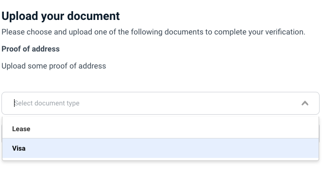
The following Smart UI configuration will request one documents from the user, which can be of type Lease or VISA.
const config = {
  documentUploads: {
    uploads: [
      {
        title: "Proof of address",
        description: 'Upload some proof of address',
        types: [{ type: "OTHER", label: "Lease" }, "VISA"]
      }
    ]
  },
}

frankieFinancial.initialiseOnboardingWidget({
  ffToken: "YOUR_TOKEN",
  config: config
});
This configuration generates the following interface:

Updated about 1 year ago
