
UI Customisation - Global
OneSDK Forms currently cover the following IDs, out of the box, by default. FrankieOne plans to add more IDs to the default forms as expands to other regions.
| OCR Review form | eKYC only form |
|---|---|
| Australian DL fields Australian Medicare fields International Passports: - Includes AU Passport Number Validation | Australian DL fields Australian Medicare fields New Zealand DL fields International Passports: - Includes AU Passport Number Validation - Includes NZ Passport Expiry date - Includes Indian Passport File number |
As explained in the previous pages, each screen is quite customisable and configurable. When it comes to Personal and ID details, you can add a custom field to the forms per country.
In the following section, we will demonstrate how to add custom fields to a document screen for a specific country.
Manual Flow - Add custom field to ID screen
To add a custom field to a document screen, you need to specify the following attributes at minimum:
| Attribute | Description | Note |
|---|---|---|
name | The name of the field to be detected by OneSDK Forms | For a custom field to be recognised and verified on FrankieOne Platform, you need to set this attribute to extraData.document_number.If you just want to save the field under the document for recording purposes, just follow this format extraData.<unique_name> |
fieldType | The type of the field to be rendered in the UI. | It can be one of the following: “input”: input text field ”select”: drop-down field ”dob”: Date of Birth field ”address”: Address field, which includes auto search and manual ”phone”: Phone number field |
dataType | The data type of this field to be processed by OneSDK Forms | For a custom field to be saved to the document object under the entity in FrankieOne platform, you need to set this attribute to document_extra |
For more details on the object field, please visit Country object configuration
{
  fieldType: 'input',
  name: 'extraData.document_number',
  dataType: 'document_extra',
}
The Document screen will render the custom field based on the order you put in the fields array. For example, in the sample below, the File number field will be displayed after Passport number.
fields: [
  {
    fieldType: 'select',
    name: 'country',
    label: 'Passport Issuing Country',
  },
  {
    fieldType: 'input',
    name: 'idNumber',
    label: 'Indian Passport Number',
  },
  {
    fieldType: 'input',
    name: 'extraData.document_number',
    dataType: 'document_extra',
    label: 'File Number',
  }
]
In the following sample, we demonstrate how to add File number for Indian Passport to the Document screen.
Note: File Number for Indian Passport is already available in OneSDK Forms, out of the box. This is a sample to demonstrate how you can add a custom field for a specific country.
const document = oneSdk.component("form", {
  name: "DOCUMENT",
  type: "manual",
  numberOfIDs: 1,
  title: {label: "Choose Your ID"},
  documents: [
    {
      type: "DRIVERS_LICENCE",
      //label: "DL",
      countries: {
        default: {
          default: {
            fields: [
              {
                fieldType: 'select',
                name: 'country',
                //label: 'Random label',
                options: [
                  {
                    label: "Australia",
                    value: "AUS"
                  },
                  {
                    label: "New Zealand",
                    value: "NZL"
                  }
                ],
                //hide: false
              }
            ]
          }
        }
      }
    },
    {
      type: "PASSPORT",
      countries: {
        default: {
          default: {
            fields: [
              {
                fieldType: 'select',
                name: 'country',
                //label: 'Random label',
                options: [
                  {
                    label: "Australia",
                    value: "AUS"
                  },
                  {
                    label: "New Zealand",
                    value: "NZL"
                  },
                  {
                    label: "India",
                    value: "IND"
                  }
                ],
                //hide: false
              }
            ]
          }
        },
        IND: {
          default: {
            fields: [
              {
                fieldType: 'select',
                name: 'country',
                label: 'Passport Issuing Country',
                options: [
                  {
                    label: "Australia",
                    value: "AUS"
                  },
                  {
                    label: "New Zealand",
                    value: "NZL"
                  },
                  {
                    label: "India",
                    value: "IND"
                  }
                ],
                //hide: false
              },
              {
                fieldType: 'input',
                name: 'idNumber',
                label: 'Indian Passport Number',
                rules:{
                  required: {
                    value: true,
                    message: "Please enter your Indian Passport Number"
                  }
                }
              },
              {
                fieldType: 'input',
                name: 'extraData.document_number',
                dataType: 'document_extra',
                label: 'File Number',
                rules:{
                  required: {
                    value: true,
                    message: "Please enter your File Number"
                  }
                }
              }
            ]
          }
        }
      }
    }
  ]
});
With the above code, the UI for Indian Passport will look like this:
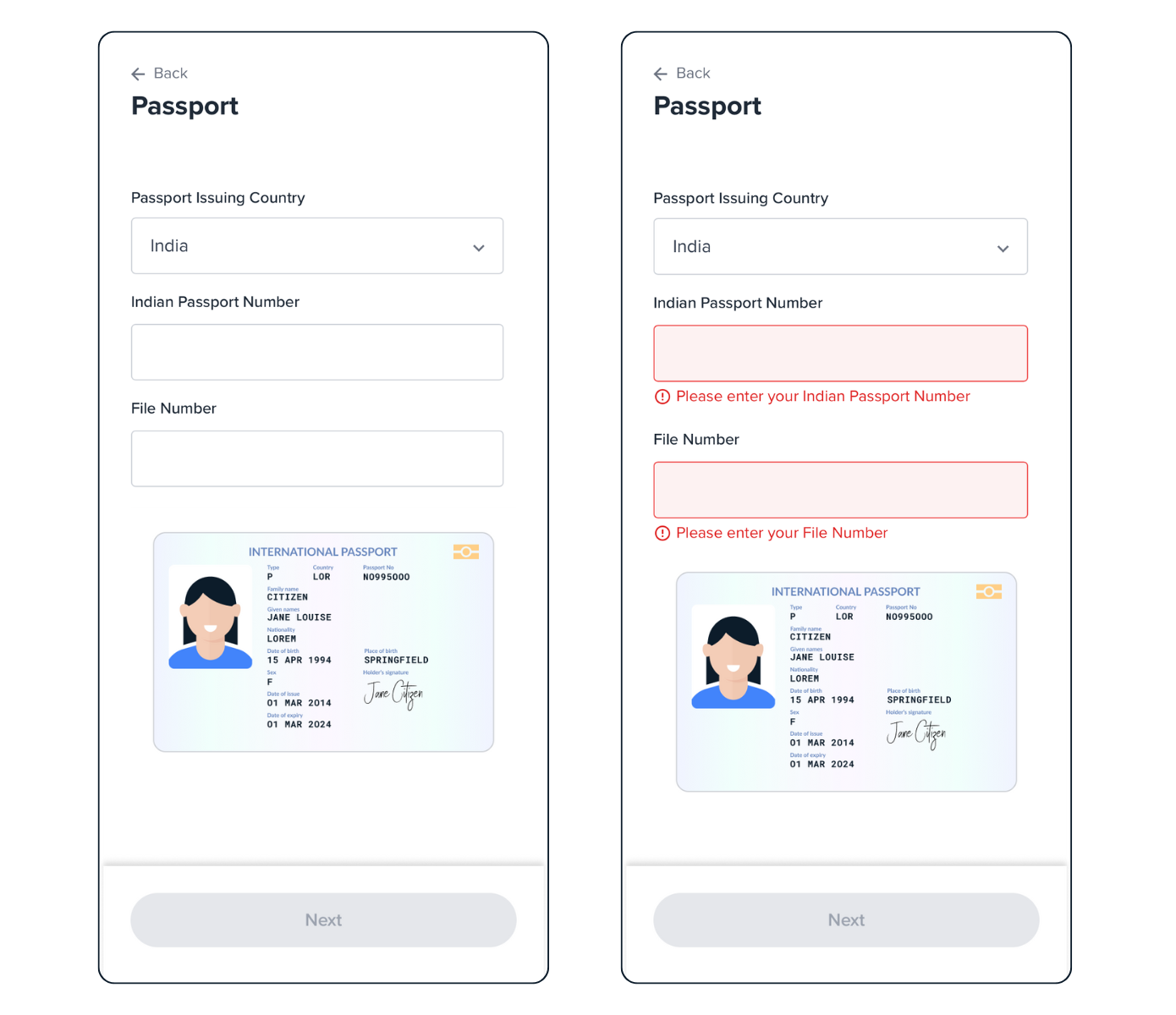
Indian Passport screens.
Updated 6 months ago