
Personal
Description
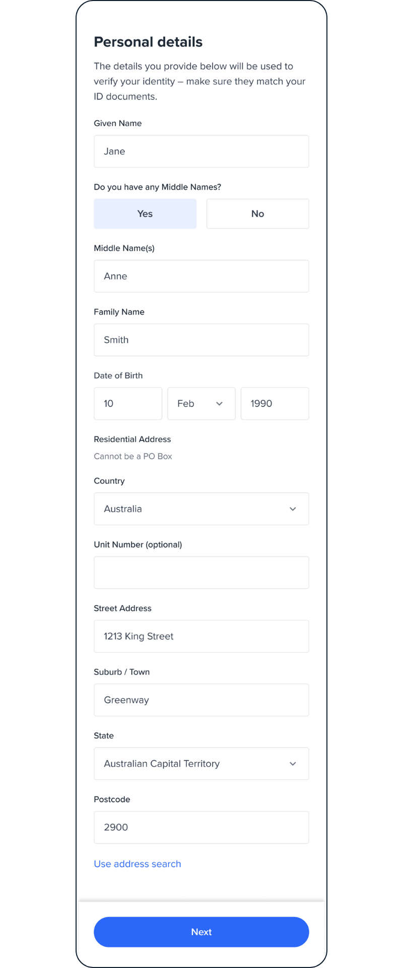
The Personal screen enables end-users to manually enter their details for verification against government data sources.
Sample Personal screen
Configuration
The configuration of the Personal page includes two main items: General and Personal.
The personal section follows a similar pattern as the other screens to configure and customise input fields, as explained below.
Field configuration
You don't need to pass all the config attributes, only pass the ones you want to customise.
To learn more about field object, please visit UI Customisation - Global.
1- General
| Attribute | Description | Usage |
|---|---|---|
| name | The name of the screen you want to load | name: PERSONAL |
| type | The type of the flow to be used. In this use case, it needs to be "manual" | type:"manual" |
| title | Title of the page. - label: the title text - style: the title style | title: {label: "<Your_TITLE>", style: {'ff-title': {}}} |
| descriptions [] | An array containing the descriptions displayed at the top of the page. - label: string - style: ff-description | descriptions: [ {label: '', style: {}}, {label: '', style: {}}, ] |
| style | The global container for the whole page to customise the spacing, padding, etc | ff-form-wrapper |
2- Personal
The personal section contains a set of fields for personal details, such as name and date of birth (DOB), that can be customised and configured with the following pattern:
- givenName
- middleName
- familyName
- dateOfBirth
- address
personal: {
  countries:{
    default:{
      default:{
        fields:[
          {
            fieldType: 'input',
            dataType: 'text',
            label: `Given Name`,
            name: 'givenName',
            rules: {
              required: {
                value: true,
                message: 'Please enter your given name',
              },
              pattern: {...},
            }
          },
          {
            fieldType: 'input',
            dataType: 'text',
            label: `Middle Name(s)`,
            name: 'middleName',
            ...
          },
          ...
        ]
      }
    }
  }
}
Name
There are three input fields for name, including given name, middle name, and family name, that you can customise the label and validation rules for them, and even remove or display them.
| Attribute | Description/ Note |
|---|---|
| fieldType | For name fields, has to be set to 'input' |
| dataType | For name fields, has to be set to 'text' |
| label | The label to be displayed for the field |
| style | |
| name | The name of the field that has been pre-defined in our platform. For the name field, it has to be one of the following:'givenName''middleName''familyName' |
| hide | true/falseTo remove or show the field. If you remove the field, it doesn't get displayed and it won't be submitted to the platform. |
| helperText | The text to be displayed below the field, to guide users. For example: 'As displayed on your ID' |
| rules: | |
| required | Specifies whether the field is mandatory or not - value: true/false - message: error message if the user doesn't enter name. Example: 'Please enter your given name' |
| pattern | regex validation pattern - value: regex value to set validation rules. Example: ^[a-zA-Z]+(\\s+[a-zA-Z]+)*$- message: error message if user enters invalid. Example: 'Please enter alphabetic characters only' |
DOB
A Date input field, including DOB, has a special configuration for calendar which will allows you to configure the type and locale.
| Attribute | Description/ Note |
|---|---|
| fieldType | For dob field, has to be set to 'date' |
| dataType | For dob field, has to be set to 'text' |
| label | The label to be displayed for the field |
| style | |
| name | The name of the field that has been pre-defined in our platform. For the DOB field, it has to be:'dateOfBirth' |
| calendarConfig: | |
| type | The type of the calendar:"gregorian": Gregorian(More calendars will be coming soon) |
| locale | The locale for the calendar:"en": English(More locale will be coming come soon) |
| day | Specify whether the day of birth is mandatory or not - required : true/false |
| month | Specify whether the month of birth is mandatory or not - required: true/false |
| year | Specify whether year of birth is mandatory or not - required: true/false |
| age | Specify a range for the accepted age. The screen will calculate and validate the age based on the input provided in the DOB field. - min: (integer) minimum accepted age - max: (integer) maximum accepted age - message: The message to be displayed if the age is not in the range. |
Address
The Address field, by default, uses an auto-search functionality for a better user experience. However, if there's no result found, there's an option for manual address inputs.
Google API Key
For the auto-search address to work, you need to provide your own Google API Key (Google Map). You can do this when you initialise OneSDK:
const oneSdk = await OneSdk({
  session: sessionObjectFromBackend,
  mode: "development",
  recipe: {
    form: {
      provider: {
        name: 'react',
        googleApiKey: "<YOUR_API_KEY>"
      },
    }
  }
});
If you don't provide a google API Key, auto-search cannot find results, and there will be a fallback in the UI for manual input.
| Attribute | Description/ Note |
|---|---|
| fieldType | For name fields, it has to be set to 'address' |
| dataType | 'current_addr''previous_addr' |
| label | The label to be displayed for the field |
| style | |
| name | The name of the field that has been pre-defined in our platform. For the address field, it has to be:'address.fullAddress' |
| hide | true/falseTo remove or show the field. If you remove the field, it doesn't get displayed and it won't be submitted to the platform. |
| helperText | The text to be displayed below the field to guide users. For example: 'Cannot be a PO Box' |
| acceptedCountries [] | Restricts the Google address search to a specific country |
| manualFieldConfig | Explained below |
manualFieldConfig:
Manual address config consists of a set of separate input fields.
manualFieldConfig: [
  {
    fieldType: 'select',
    dataType: 'text',
    hide: false,
    label: 'Country',
    name: 'address.country',
    options: [{label: , value:},{}],
    rules: {
      required: {
        value: true,
        message: `Please select your country`,
      },
      pattern: {
        ...,
      },
    },
  },
  {
    fieldType: 'input',
    dataType: 'text',
    hide: false,
    label: 'Unit Number (optional)',
    name: 'address.unitNumber',
    rules: {
      pattern: {
        ...,
      },
    },
  },
  {
    fieldType: 'input',
    dataType: 'text',
    hide: false,
    label: 'Street Address',
    name: 'address.streetAddress',
    rules: {
      required: {
        value: true,
        message: 'Please enter your street address',
      },
      pattern: {
        ...,
      },
    },
  },
  {
    fieldType: 'input',
    dataType: 'text',
    hide: false,
    label: 'Suburb / Town',
    name: 'address.town',
    rules: {
      required: {
        value: true,
        message: 'Please enter your suburb/town.',
      },
      pattern: {
        ...,
      },
    },
  },
  {
    fieldType: 'select',
    dataType: 'text',
    hide: false,
    label: 'State',
    name: 'address.state',
    placeholder: 'Select Your State',
    options: [{label: , value:},{}],
    rules: {
      required: {
        value: true,
        message: 'Please enter your state',
      },
      pattern: {
        ...,
      },
    },
  },
  {
    fieldType: 'input',
    dataType: 'text',
    hide: false,
    label: 'Postcode',
    name: 'address.postalCode',
    rules: {
      required: {
        value: true,
        message: 'Please enter your postal code',
      },
      pattern: {
        ...,
      },
    },
  },
],
Each manual address field follows the same data field structure, for the following field names:
- country
- unitNumber
- postcode
- state
- streetNumber
- streetName
- town
| Attribute | Description/ Note |
|---|---|
| label | label of the field |
| name | It has to be one of the following items, based on the field name:'address.country' 'address.unitNumber' 'address.postalCode' 'address.state' 'address.streetNumber' 'address.streetName' 'address.town' |
| fieldType | 'select' for country and state'input' for the rest |
| dataType | 'text' |
| options | List of items to be displayed for a drop-down menu. Only applicable to country and stateAn array of [{label: "", value: ""}, {label: "", value: ""}] |
| rules: | |
| required | Specifies whether the field is mandatory or not - value: true/false - message: error message if user doesn't provide any input. Example: 'Please enter your suburb/ town' |
| pattern | regex validation pattern - value: regex value to set validation rules. Example: ^[a-zA-Z]+(\\s+[a-zA-Z]+)*$- message: error message if user enters invalid. Example: 'Please enter alphabetic characters only' |
Internationalisation
The configuration explained above is a generic configuration applied to all countries and states, by default. The OneSDK modular form will also allow you to overwrite the configuration for any specific country to meet international requirements. To learn more, please visit UI Customisation - Global.
Sample code
const personal = oneSdk.component("form", {
  name: "PERSONAL",
  type: "manual",
  personal: {
    countries:{
      default:{
        default:{
          fields:[
            {
              fieldType: 'input',
              dataType: 'text',
              name: 'givenName',
              hide: false,
              rules:{
                minLength: {
                  value: 7,
                  message: 'Given name must be at least 7 charecters',
                },
                maxLength: {
                  value: 10,
                  message: 'Given number must not exceed 10 charecters',
                },
              }
            }
          ]
        }
      }
    }
  }
});
Events
| Event name | Description | Arguments |
|---|---|---|
| form:personal:loaded | inputInfo: {type:'manual'} | |
| form:personal:ready | Upon clicking on the button, this event will be triggered, and you can listen to it to load another screen. | inputInfo: {type:'manual'} |
| form:personal:failed | inputInfo: {type:'manual'}, message?: string |
Customisation
Removing the fields
You can customise the review screen to remove the fields, based on your workflow.
As an example, if you want to remove Date of Birth (DOB) and address for Medicare card, or remove address for Passport, you can define different instances of the review screen and load them based on the document type.
Refer to the code below for examples of how to remove certain fields from the review screen:
const document = oneSdk.component("form", {
  name: "PERSONAL",
  type: "manual",
  personal: {
    countries:{
      default:{
        default:{
          fields:[
            {
              fieldType: 'date',
              name: 'dateOfBirth',
              hide: true
            },
            {
              fieldType: 'address',
              name: 'address.fullAddress',
             hide: true
            }
          ]
        }
      },
      AUS:{
        default:{
          fields:[
            {
              fieldType: 'date',
              name: 'dateOfBirth',
              hide: true
            },
            {
              fieldType: 'address',
              name: 'address.fullAddress',
              hide: true
            }
          ]
        }
      }
    }
  }
});
If you modify fields in the forms, make sure to apply the changes to the default configuration and the fallback configuration (AUS). Not doing so may result in fields reappearing.
This applies not only to the hide/show function but also to other changes in the configuration such as changing labels. Additionally, if you hide or modify the configuration, you will need to apply it specifically for a particular country.
For example, the sample code below shows that the field with the name: address is hidden (hide: true) in the default countries configuration. To ensure that the same field is hidden for the other country (alpha3digit_country_code), the default should also be declared .
countries : {
   default: {
      default: {
          fields: [ { name: 'address', hide: true ... } ]
       }
    },
   <alpha3digit_country_code>: {
        default: {
              fields: [ { name: 'address', hide: true ... } ]
        }
   }
}
Styling customisation
You can use the following classes to customise the styling for different elements of the page. These CSS classes apply to the common elements across all the screens. If you want to customise a specific page, you can use the above configuration options to overwrite it.
| Item | CSS Class |
|---|---|
| title | ff-title |
| description | ff-description |
| button | ff-button |
| Page container | ff-form-wrapper |
| Input Fields | ff-form-field |
The following code shows you how to style a specific element on the page, in this example the button's background color will be green, instead of the default blue.
<style>
    #<you_div_container> .ff-button {
      background-color: green;
    }
 </style>
Updated 3 months ago