Welcome
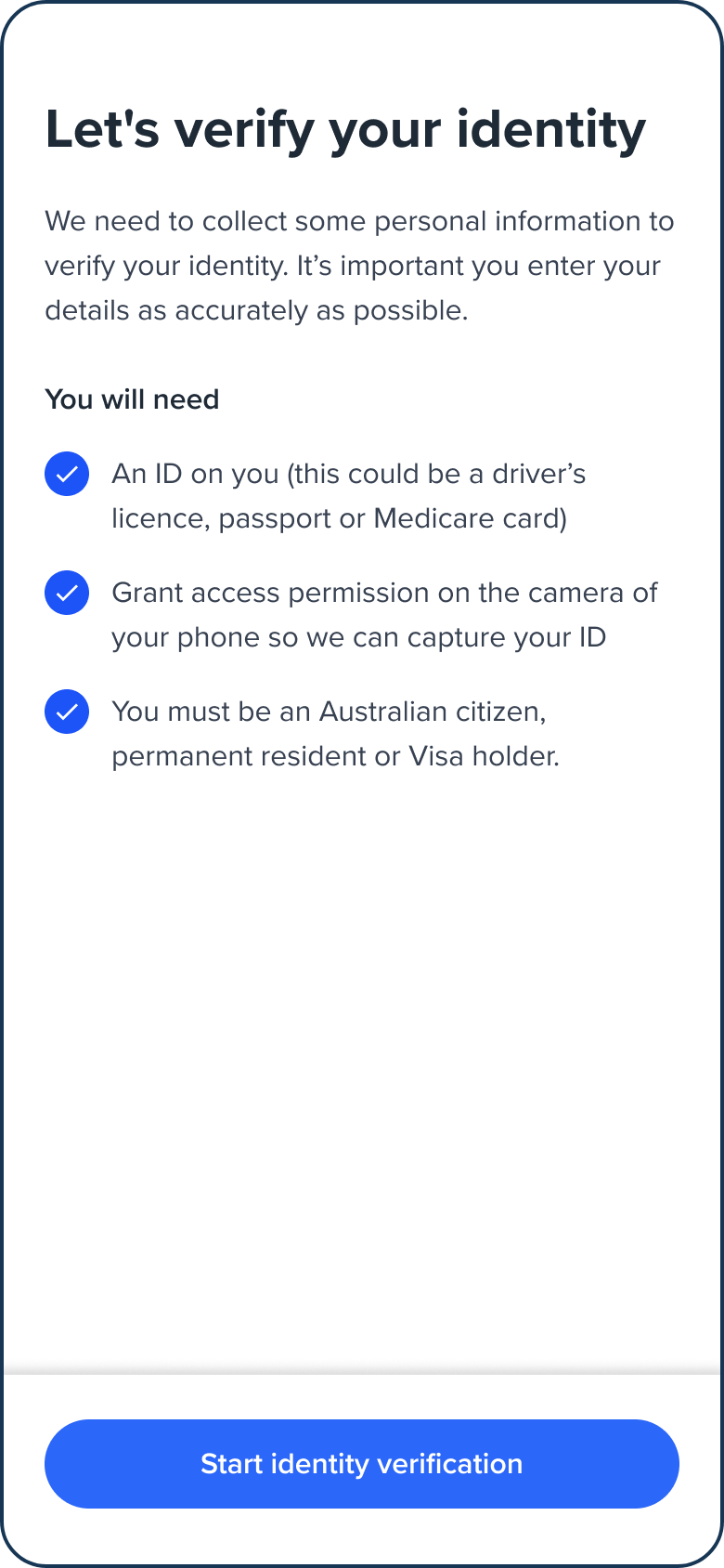
The Welcome screen provides information to the user about the onboarding process and reminders before they start onboarding.
Default Welcome screen

Configuration
Use the following table to learn more about configuration options for the Welcome screen.
| Item | Description | Usage |
|---|---|---|
| name | The name of the screen you want to load | name: "WELCOME" |
| type | The type of the flow to be used. In this use case, it needs to be "ocr". | type: "ocr" |
| title | Title of the page. The default is "Let's verify your identity". - label: the title text - style: the title styling | title: {label: "<Your_TITLE>", style: {'ff-title': {}}} |
| descriptions[] | An array containing the descriptions displayed at the top of the page. - label: string - style: ff-description | descriptions: [ {label: '', style: {}},{label: '', style: {}}, ] |
| instructions | An array of bulleted instructions - label: The heading of instructions - style: ff-instructions- content [ - icon: SVG icon - label: The text displayed in front of the icon ] | |
| cta | The button - label: the button text - style: ff-button |
Sample code
const form_welcome = oneSdk.component("form", {
  name: 'WELCOME',
  type: 'ocr',
  title: {
    label: 'Let\'s get you onboarded'
  },
  descriptions: [
    {
      label: 'To join us you need to be over 18 years old.'
    },
    {
      label: 'You will need a valid form of identity. Valid types include ...'
    },
  ],
  instructions: {
    content: [
      {
        label: "fill out each page"
      }
    ]
  },
  cta: {
    label: 'Start'
  }
});
Events
| Event name | Description | Arguments |
|---|---|---|
| form:welcome:loaded | inputInfo: {type:'ocr'} | |
| form:welcome:ready | Upon clicking on the button, this event will be triggered, and you can listen to it to load another screen/module. | inputInfo: {type:'ocr'} |
| form:welcome:failed | inputInfo: {type:'ocr'}, message?: string |
Styling customisation
You can use the following classes to customise the styling for different elements of the page. These CSS classes apply to the common elements across all the screens. If you want to customise a specific page, you can use the above configuration options to overwrite it.
| Item | CSS Class |
|---|---|
| title | ff-title |
| descriptions | ff-description |
| instructions | ff-instructions |
| button | ff-button |
The following code shows you how to style a specific element on the page, in this example the button's background color will be green, instead of the default blue.
<style>
    #<you_div_container> .ff-button {
      background-color: green;
    }
 </style>
Updated 2 months ago
