
Document
Description
You can use the Manual Document screen to capture ID details manually from end users. With the Document screen, you have the ability to capture one or multiple IDs.
Default Document screen
One ID flow:
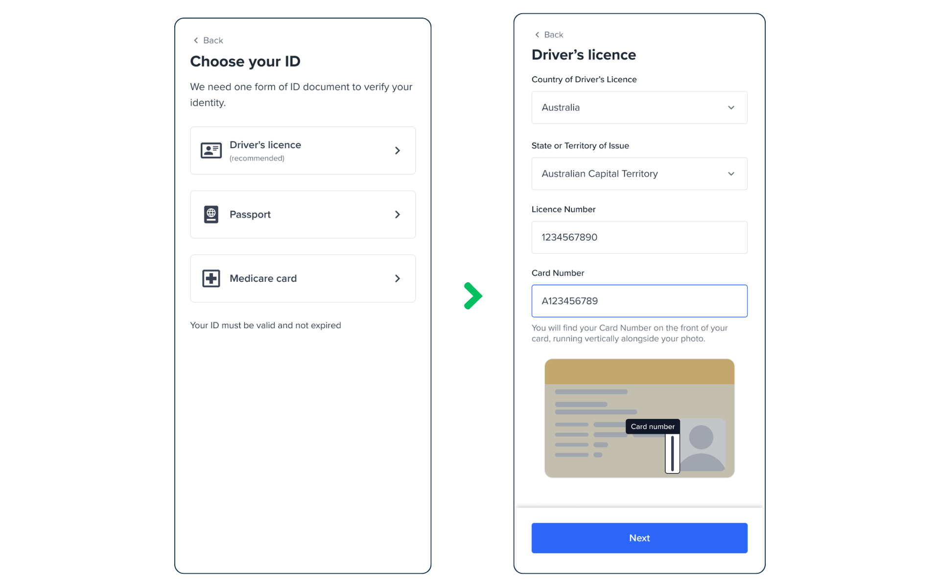
One ID flow screens.
Two IDs flow:
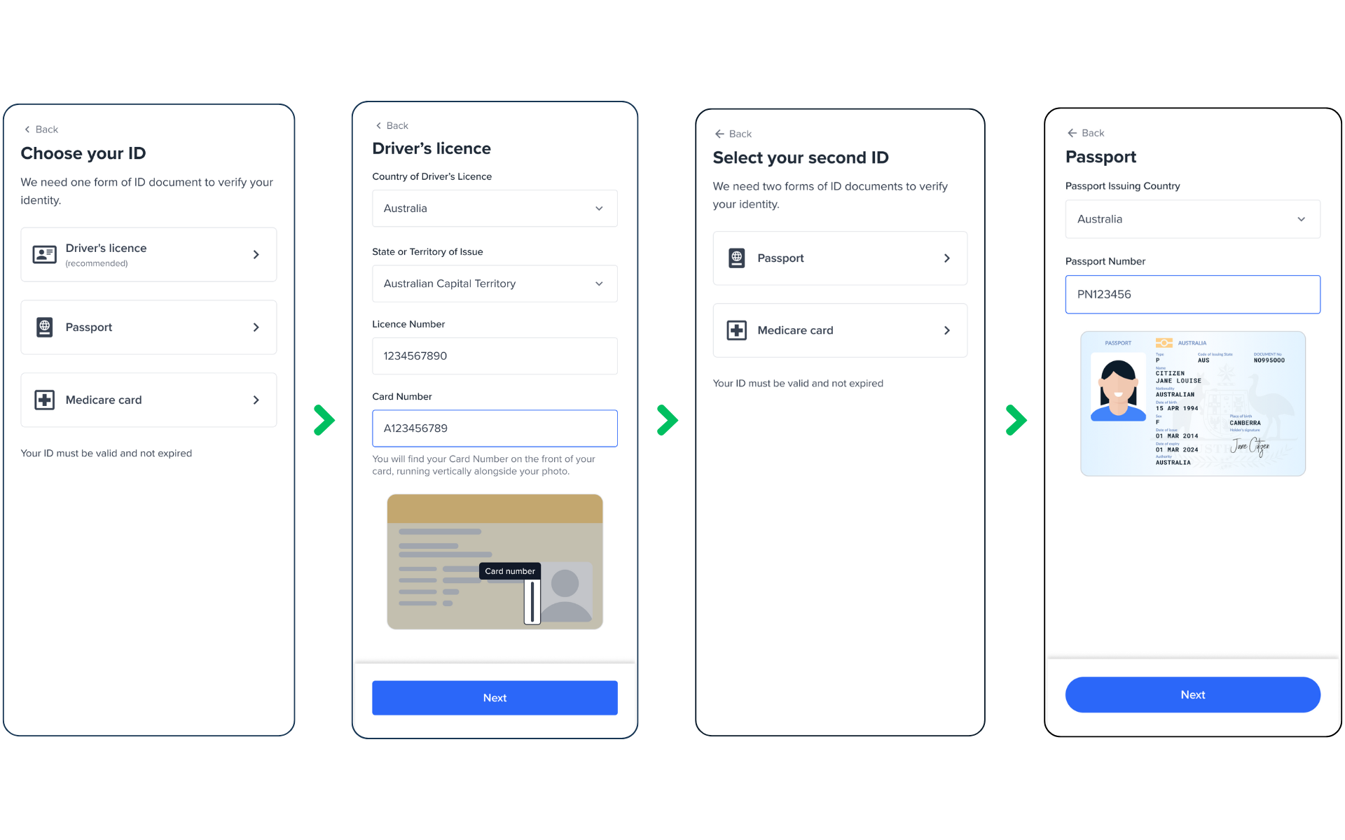
Two IDs Flow screens.
Configuration
The configuration of the Document page includes two main items: General and Document.
The document section follows a similar pattern as the other screens to configure and customise input fields, which is explained below.
1- General
| Attribute | Description | Usage |
|---|---|---|
| name | The name of the screen you want to load | name: DOCUMENT |
| type | The type of the flow to be used. In this use case, it needs to be "manual" | type:"manual" |
| title | Title of the page. The default is "Choose your ID" - label: the title text - style: the title style. ff-title:{} | title: {label: "<Your_TITLE>", style: {'ff-title': {}}} |
| numberOfIDs | The number of ID documents that the user must submit for this flow. | |
| descriptions[] | An array containing the descriptions displayed at the top of the page. - label: - style: ff-description:{} |
Multiple IDs
You can set your manual flows to have the user submit more than one ID document using the numberOfIDs parameter.
After submitting the first document, the flow will go to another document selection screen for the user to select another document type. Once the required number of documents has been submitted, the user will proceed to the next page in the flow.
To customise what ID types to be displayed in the ID Selection screen, you can simply specify a list of IDs:
const form_document = oneSdk.component("form", {
  name: "DOCUMENT",
  type: "manual",
  numberOfIDs: 2,
  documents: [
    {
      type: "DRIVERS_LICENCE"
  	},
    {
      type: "NATIONAL_HEALTH_ID"
  	},
 	 	{
    	type: "PASSPORT"
		}
	]
});
For more details on the Document configuration, read the following section.
2- Documents
Document screen for the manual flow is a combination of an ID selection screen and an ID details screen.
You can configure an array of document types as well as an array of fields for each document type.
| Attribute | Description |
|---|---|
| Configs related to ID Selection Screen | |
| type | The ID type you need to show in the list"DRIVERS_LICENCE""PASSPORT""NATIONAL_HEALTH_ID" |
| style | ff-document |
| label | The title text for the document type. |
| subtitle | The text below the title. |
| icon | SVG icon |
| Configs related to ID Details screen | |
| countries {} | To configure an array of fields to be displayed in the ID details(explained below) |
When you select a document type in the ID selection screen, it proceeds to the next page and displays a set of fields. For each document type, you can customise the fields, by passing an array of fields, following the below pattern. In the array, only specify the fields you need to configure/customise and skip the rest.
| Attribute | Description/ Note |
|---|---|
| fieldType | For Driver's Licence state: 'select'For Driver's Licence licence number: 'input'For Driver's Licence card number: 'input'For Medicare card colour: 'select'For Medicare card number: 'input'For Medicare position: 'input'For Medicare expiry: 'date'For Passport country: 'input'For Passport number: 'input' |
| dataType | 'text' |
| label | The label to be displayed for the field |
| style | |
| name | The name of the field that has been pre-defined in our platform: For Driver's Licence state: 'region'For Driver's Licence licence number: 'idNumber'For Driver's Licence card number: 'extraData.document_number'For Medicare card colour: 'idSubType'For Medicare card number: 'idNumber'For Medicare position: 'extraData.reference'For Medicare expiry: 'idExpiry'For Passport country: 'country'For Passport number: 'idNumber' |
| hide | true/falseTo remove or show the field. If you remove the field, it doesn't get displayed and it won't be submitted to the platform. |
| helperText | The text to be displayed below the field to guide users. For example: 'As displayed on your ID' |
| placeholder | The text to be displayed inside the field. For example: 'Select DL State or Territory' |
| rules: | |
| required | specifies whether the field is mandatory - value: true/ false - message: The error message if user doesn't enter name. Example: 'Please enter your given name' |
| minLength | minimum length of the field to be validated - value: integer - message: The error message if user enters less than minimum length |
| maxLength | maximum length of the field to be validated - value: integer - message: error message if user enters more than maximum length |
| pattern | regex validation pattern - value: regex value to set validation rules. Example: ^[a-zA-Z]+(\\s+[a-zA-Z]+)*$- message: error message if user enters invalid value. Example: 'Please enter alphabetic characters only' |
Internationalisation
The configuration explained above is a generic configuration applied to all countries and states, by default. The OneSDK modular form will also allow you to overwrite the configuration for any specific country to meet international requirements. To learn more, please visit International IDs.
Sample code
const form_document = oneSdk.component("form", {
  name: "DOCUMENT",
  type: "manual",
  numberOfIDs: 2,
  title: {label: "Choose Your ID"}
  documents: [
    {
      type: "DRIVERS_LICENCE",
      label: "DL",
      countries: {
        default: {
          default: {
            fields: [
              {
                fieldType: 'select',
                hide: false,
                dataType: 'text',
                label: `Driver's Licence State or Territory`,
                name: 'region',
                rules: {
                  required: {
                    value: true,
                    message: `Please enter your driver's licence number`,
                  },
                  minLength: {
                    value: 1,
                    message: `Licence number must be at least 1 digits`,
                 	},
                  maxLength: {
                    value: 15,
                    message: `Licence number must not exceed 15 characters`,
                  },
                  pattern: { ... }
                }
              },
           		{
              	fieldType: 'input',
                hide: false,
               	dataType: 'text',
                label: 'Licence Number',
                name: 'idNumber',
                rules: {
                    ...
                },
              },
              {
                fieldType: 'input',
                hide: false,
                dataType: 'text',
                label: 'Card Number',
                name: 'extraData.document_number',
                rules: {
                    ...
                },
              },
            ]
          }
   			}
    	}
  },
  {
    type: "PASSPORT",
    countries: {
        default: {
          default: {
            fields: [
              ....
            ]
          }
        }
    }
  }
]
});
Events
| Event name | Description | Arguments |
|---|---|---|
| form:document:loaded | inputInfo: {type:'manual'} | |
| form:document:navigate | ||
| form:document:ready | Upon clicking on the last screen button, this event will be triggered, and you can listen to it to load another screen. | inputInfo: {type:'manual'} |
| form:document:failed | inputInfo: {type:'manual'}, message?: string | |
| form:document:back | Upon clicking on the back link, this event will be triggered. | inputInfo: {type:'manual'} |
Styling customisation
You can use the following classes to customise the styling for different elements of the page. These CSS classes applies to the common elements across all the screens. If you want to specifically customise a specific page, you can use the above configuration to overwrite it.
| Item | CSS Class | Note |
|---|---|---|
| title | ff-title | |
| subtitle | ff-subtitle | |
| descriptions | ff-description | |
| instructions | ff-instructions | |
| document | ff-document |
The following code shows you how to style a specific element on the page, in this example the button's background color will be green, instead of the default blue.
<style>
    #<you_div_container> .ff-button {
      background-color: green;
    }
 </style>
Updated 6 months ago