
Result
Description
The Result screen is a generic screen that you can embed at any point of your onboarding experience to display a relevant message to the user to handle happy or unhappy paths.
This screen is also internally used by other screens, such as Review, as needed.
Default Result screens
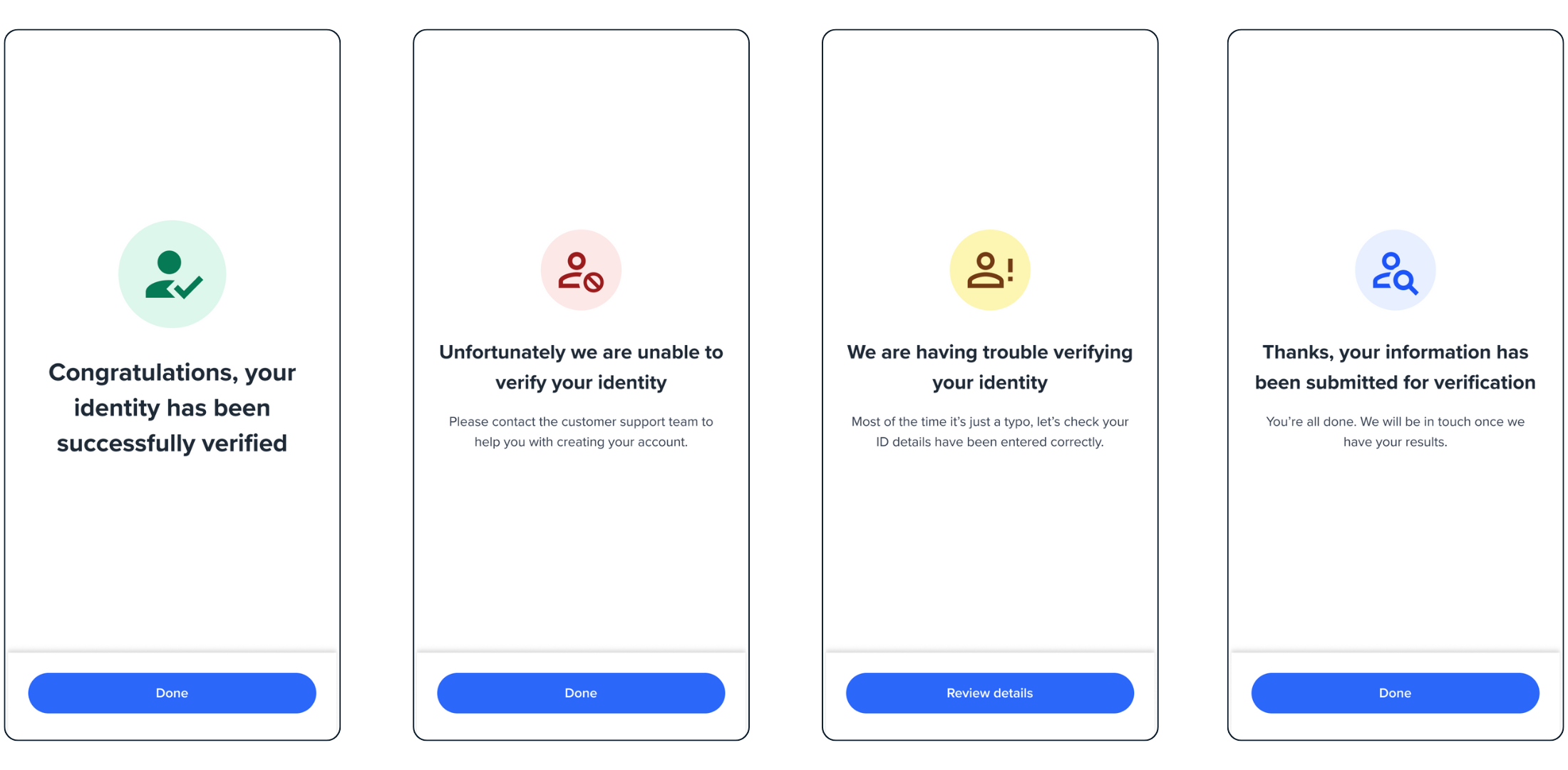
There are four different default result screens available:
- Success/ Complete
- Fail
- Partial Match
- Pending
Review screen.
You can customise the title, description, and button to display any kind of happy and unhappy path messages in your onboarding experience, as explained in the following section.
Configuration
| Attribute | Description | Usage |
|---|---|---|
| name | The name of the screen you want to load | name: RESULT |
| type | The type of the flow to be used. In this use case, it needs to be "manual" | type:"manual" |
| title | the title displayed at the bottom of the icon - label: the title text - style: the title style. ff-title:{} | title: {label: "<Your_TITLE>", style: {'ff-title': {}}} |
| descriptions[] | An array containing the descriptions displayed under the title. - label: - style: ff-description:{} | |
| cta | The button. - label: the text to be displayed on the button. - style: ff-button` | |
| state | Specify the state of the result to display one of the result screens. The state also determines the event type to be emitted upon clicking on the button. - SUCCESS- FAIL- PARTIAL- PENDING | state: {type: SUCCESS|FAIL|PARTIAL|PENDING} |
Sample Code
const result = oneSdk.component("form", {
  name: "RESULT",
  type: "manual",
  state: 'SUCCESS',
  title: {label:'Complete'},
  descriptions: [{label:'Process is now complete. You can close the page'}],
  cta:{label: 'Done'}
});
Events
| Event name | Description | Arguments |
|---|---|---|
| form:result:loaded | When the result screen is loaded, this event gets emitted. | “form:result:loaded”: inputInfo: {type:'manual'} |
| form:result:success | When you load success screen and click on the button, this event gets emitted | “form:result:success” inputInfo: {type:'manual'} |
| form:result:failed | When you load fail screen and click on the button, this event gets emitted | “form:result:failed” inputInfo: {type:'manual'} |
| form:result:partial | When you load partial match screen and click on the button, this event gets emitted | “form:result:partial” inputInfo: {type:'manual'} |
| form:result:pending | When you load pending screen and click on the button, this event gets emitted | “form:result:pending” inputInfo: {type:'manual'} |
Styling customisation
You can use the following classes to customise the styling for different elements of the page. These CSS classes applies to the common elements across all the screens. If you want to specifically customise a specific page, you can use the above configuration to overwrite it.
| Item | CSS Class | Note |
|---|---|---|
| title | ff-title | |
| subtitle | ff-subtitle | |
| descriptions | ff-description |
The following code shows you how to style a specific element on the page, in this example the button's background color will be green, instead of the default blue.
Updated 7 months ago