
Review
Description
The Review screen for the manual flow provides users a chance to review the details before submitting for verification. It consists of two main sections: Personal details including name, date of birth, and address, and Document details for each captured ID.
It automatically navigates back to the previous screens if you need to edit the details.
Default Review screen
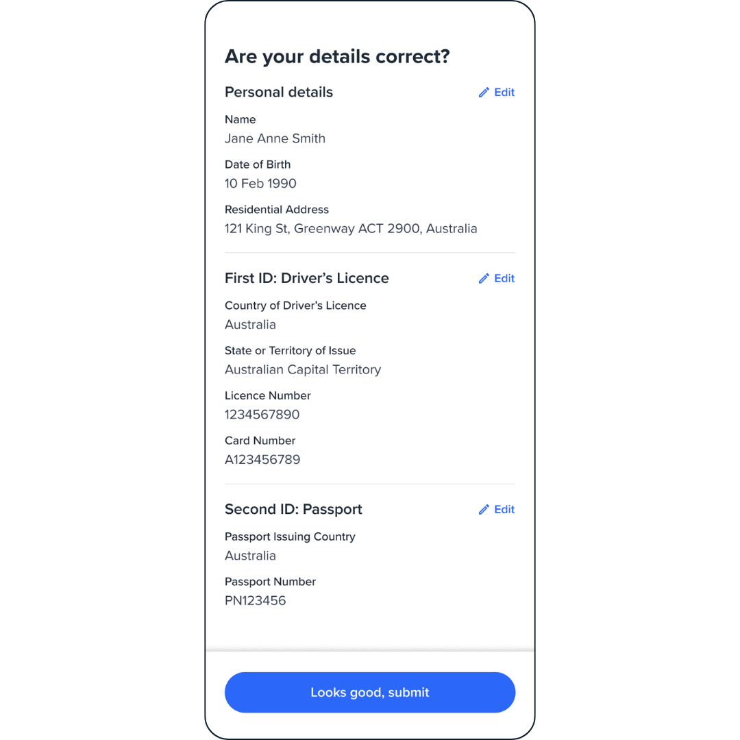
Review screen.
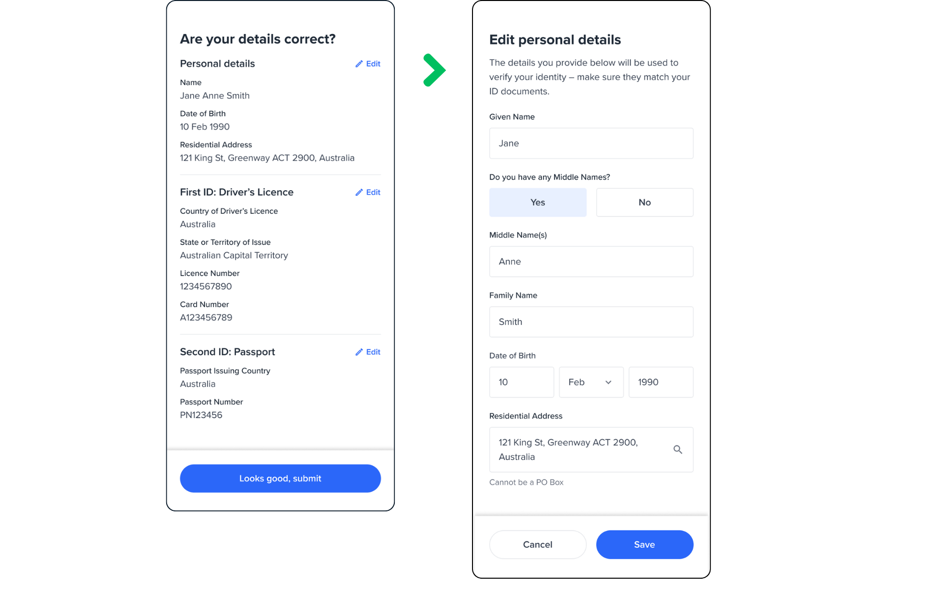
Edit button action
Depending on which Edit button the users select, they will be redirected to the corresponding pages:
- Personal details Edit button - the user will be redirected back to the Personal page.
- ID Edit button - the user will be redirected back to the Document selection page. From there, they can edit the information for their selected ID type, or choose a different ID type instead.
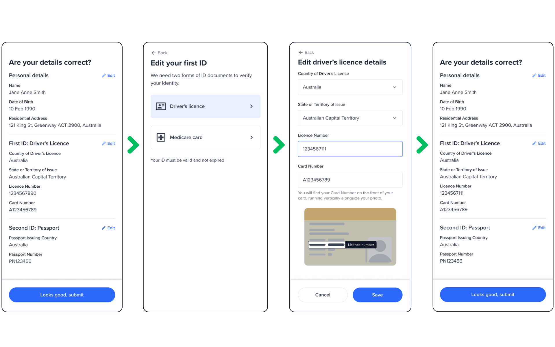
Edit First ID.
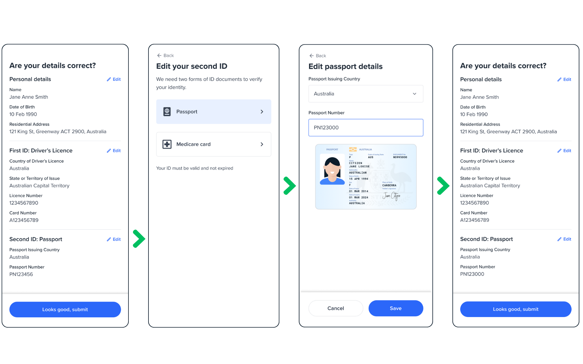
Edit Second ID.
Configuration
The configuration of the review screen includes the following:
| Attribute | Description | Usage |
|---|---|---|
| name | The name of the screen you want to load | name: REVIEW |
| type | The type of the flow to be used. In this use case, it needs to be "manual" | type:"manual" |
| title | Title of the page. - label: the title text - style: the title style | title: {label: "<Your_TITLE>", style: {'ff-title': {}}} |
| style | The global container for the whole page | ff-form-wrapper |
| cta | The button. - label: the button text - style: the button style | title: {label: "<Your_label>", style: {'ff-button': {}}} |
| verify | true/false If set to true, it runs a check and displays a result screen automatically. |
Edit Personal and Documents
Edit button will render the previous Personal and Document screens automatically. If you already have customised and configured the previous screens, the review screen will automatically fetch those configurations saved in the session and apply them when rendering the edit screens.
Submit and Verify
If verify config is set to false, and user clicks on the submit button, details will just be saved onto the applicant, and it's done.
If verify config is set to true, user details will be saved onto the applicant and a verification check (based on the entity profile) will be run. A loading screen is displayed automatically while the check is running. Once the check results are ready, the review screen will internally render one of the result screens automatically depending on the check results.
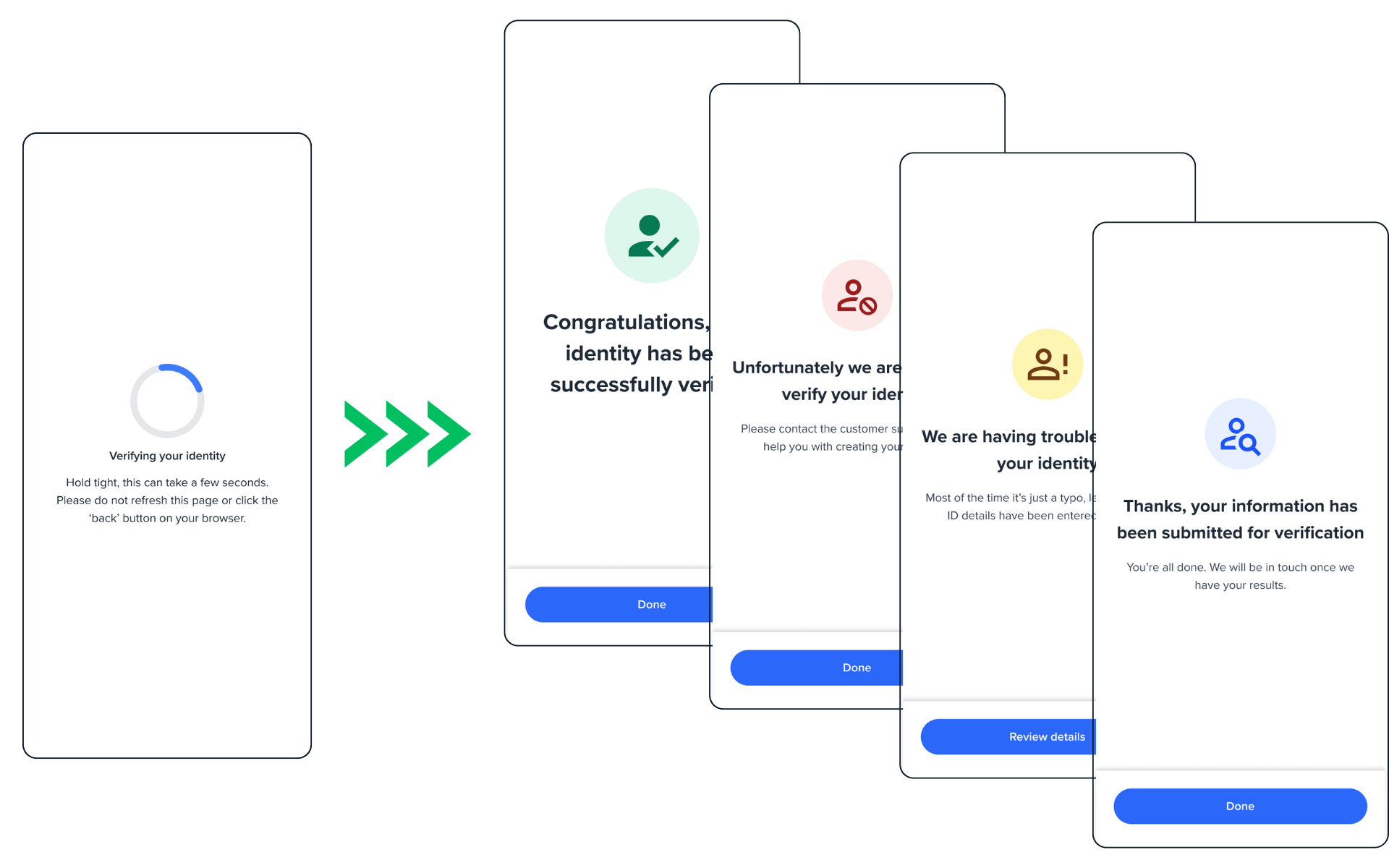
Verify screen to Results screen.
Sample code
const review = oneSdk.component("form", {
  name: "REVIEW",
  type: "manual",
  verify: true
});
Events
| Event name | Description | Arguments |
|---|---|---|
| form:review:loaded | inputInfo: {type:'manual'} | |
| form:review:ready | Upon clicking on the button, this event will be triggered, and you can listen to it to load another screen. | inputInfo: {type:'manual'} |
Please note, when you enable the verify as part of the Review screen and get to the result screen, the events specified here for the result screen will be applicable.
Customisation
Styling customisation
You can use the following classes to customise the styling for different elements of the page. These CSS classes apply to the common elements across all the screens. If you want to customise a specific page, you can use the above configuration options to overwrite it.
| Item | CSS Class |
|---|---|
| title | ff-title |
| button | ff-button |
| Page container | ff-form-wrapper |
The following code shows you how to style a specific element on the page, in this example the button's background color will be green, instead of the default blue.
<style>
    #<you_div_container> .ff-button {
      background-color: green;
    }
 </style>
Updated 5 months ago