
IdScanVerification version log
Executing liveness and OCR verifications after the KYC checks
When the option IdScanVerification is defined, we use the Onfido Web SDK to execute the document scan and selfie captures, and use it when assessing the user's check status.
We wrap the Onfido SDK to simplify the integration and only update versions when it makes sense. To define which version of our wrapper you'd like to use, include releaseVersion in the object passed to idScanVerification.
initialiseOnboardingWidget({
  config: {
    idScanVerification: {
      releaseVersion: "v1.3"
    }
  }
})
Below you'll find a list of the wrapper's versions that you might choose to use along with the Smart UI.
Wrapper version log
| Version | Description |
|---|---|
| v1.4 (new) | - Onfido Web SDK v13.8.4 - The browser camera now replaces the native camera - If useLiveness is true, the customer will use Onfido Motion. - If Moving from v1.0, this is a potential breaking change as the layout changed in Onfido SDK 12 and above |
| v1.3 (new) | - Onfido WebSDK v13.8.4 - Improved logs (added IP address and updated device and location logging) - The browser camera now replaces the native camera - If useLiveness is true, the customer will use Onfido Video. - If Moving from v1.0, this is a potential breaking change as the layout changed in Onfido SDK 12 and above |
| v1.2 (existing) | - Onfido Web SDK v12.4.0 - Replaced video with motion as default option when useLiveness is true |
| v1.1 (existing) | - Onfido Web SDK v12.4.0 - New modal layout. Potential Breaking change. (see comparison below) - Improved UI responsiveness - Removed injectedCss option |
| v1.0 (existing) | - Onfido Web SDK v8.3.0 |
Default fallback option
For v1.2, Onfido Motion will be set as the default liveness check. If the user's device doesn't support Onfido Motion, the user will get an error in the browser.
In v1.1, where the default liveness check is Onfido Video, if the user's device is not supported, it defaults to the selfie photo liveness check automatically.
New modal layout (v1.1+)
Removed option
injectedCssThe biggest changes with this new layout are:
- Onfido styles are no longer scoped to the Smart UI
- The HTML elements will most likely use different selectors, so simply applying the old styles in
injectedCssglobally might not work. Please review the impact of this change within your application before using it in production.
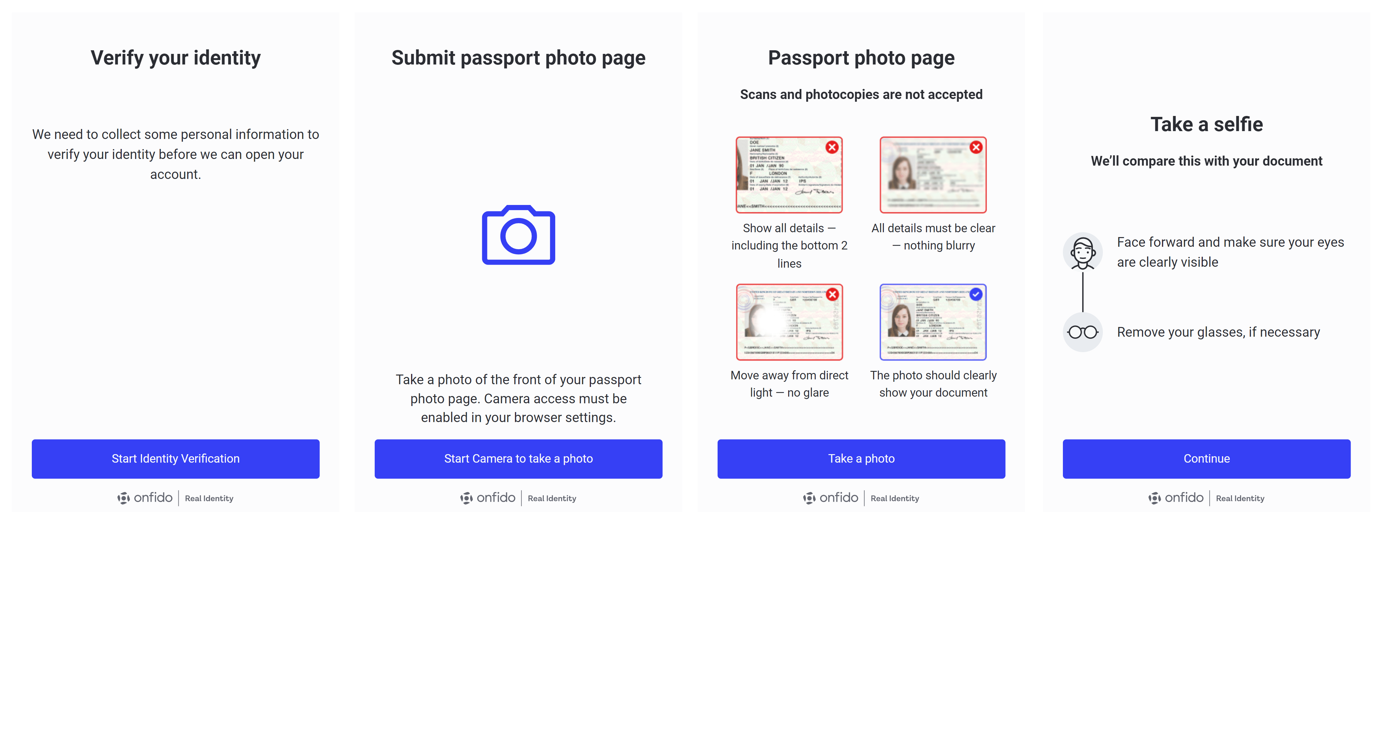
The following images display the new modal layout deployed with version 1.1 and newer.
In the mobile view, the content is designed to be responsive and stretches to fill up the screen, with a thin border outline enhancing the visual clarity. When viewed on a desktop, the design shifts to feature a white modal set against a grey backdrop, providing a distinct contrast. Generally, both views are equipped with a Back button and a Close button, ensuring easy navigation for the user. These features collectively enhance the user experience, regardless of the device used.
Mobile view
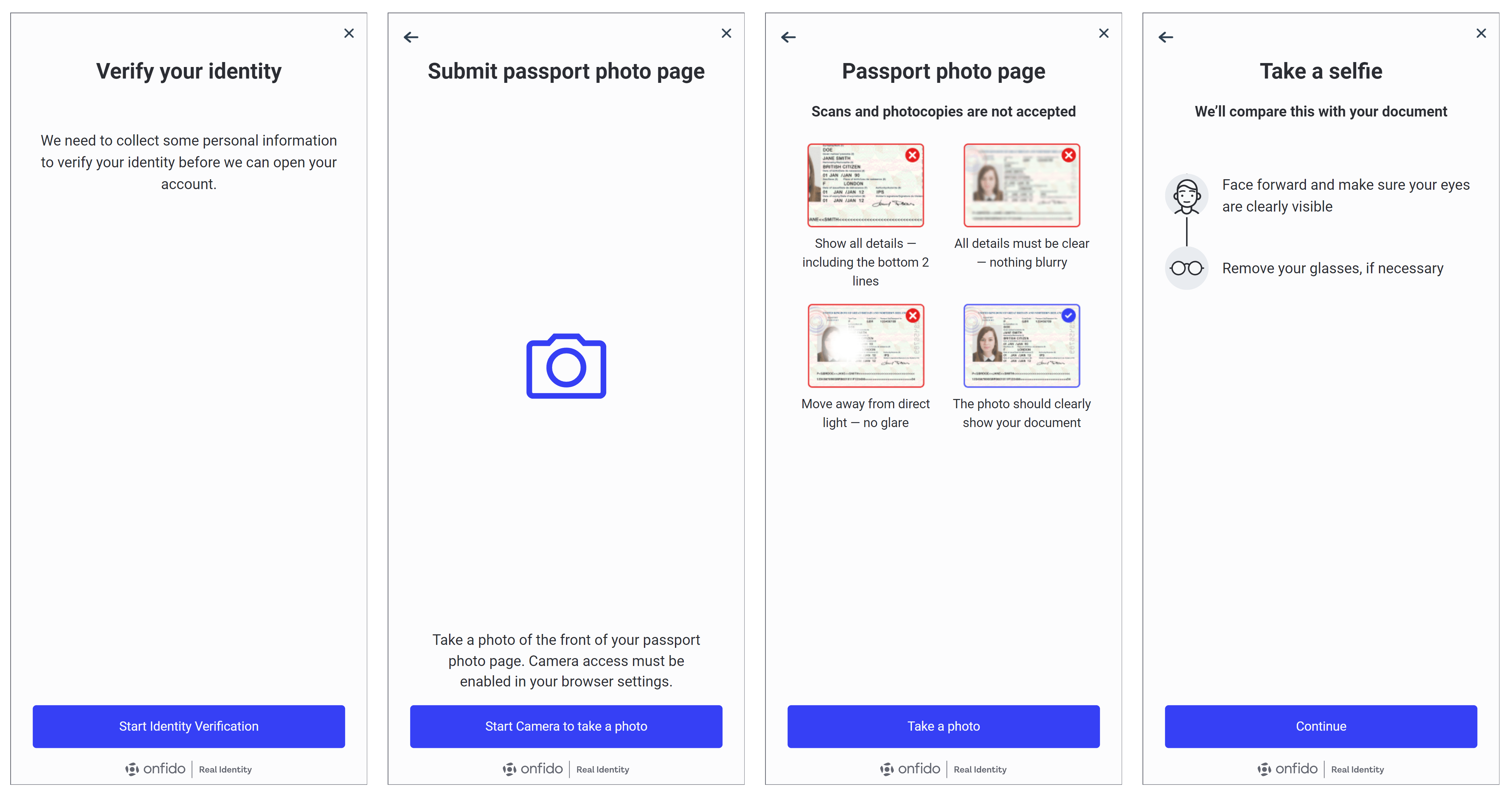
Desktop view
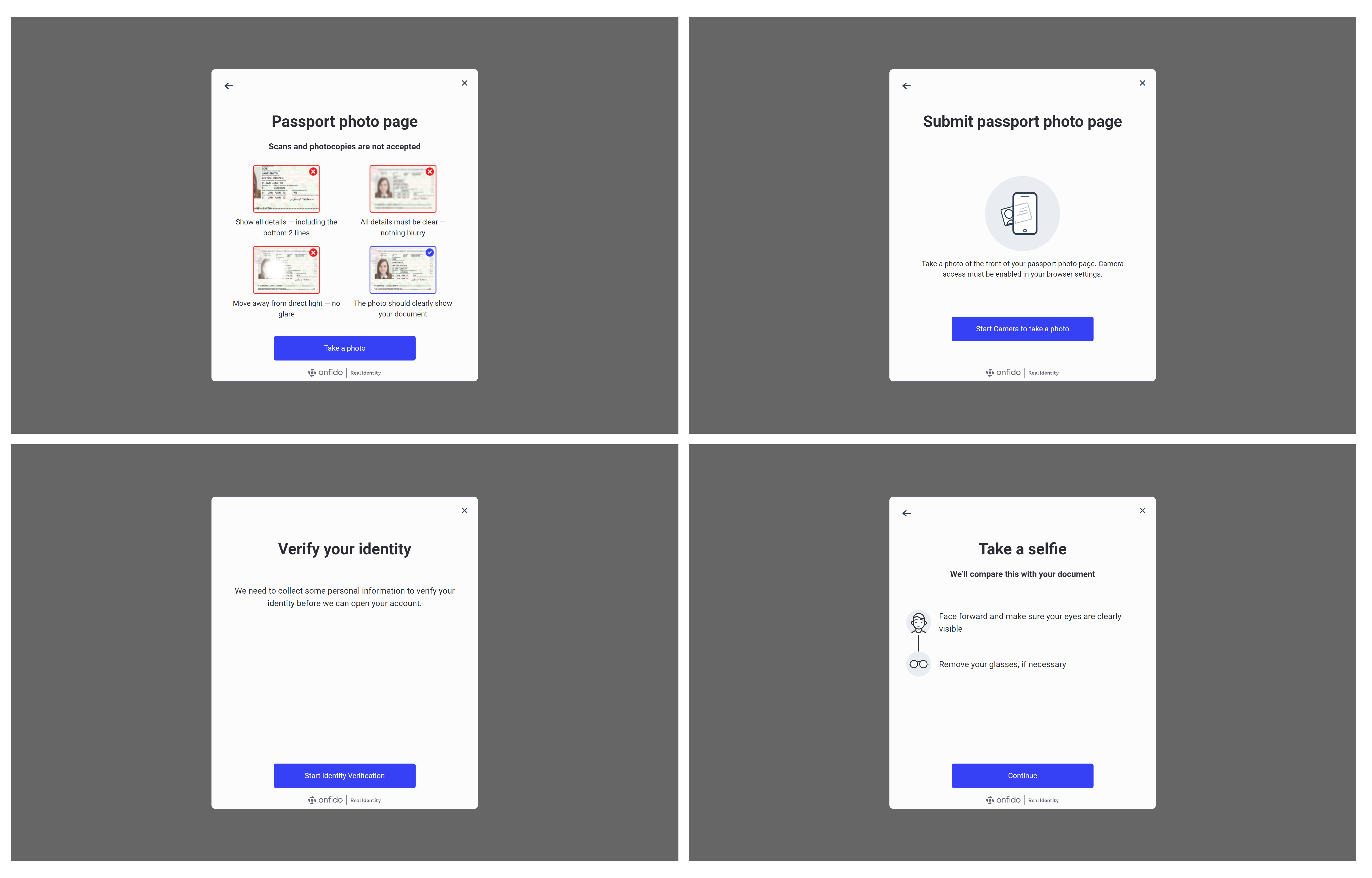
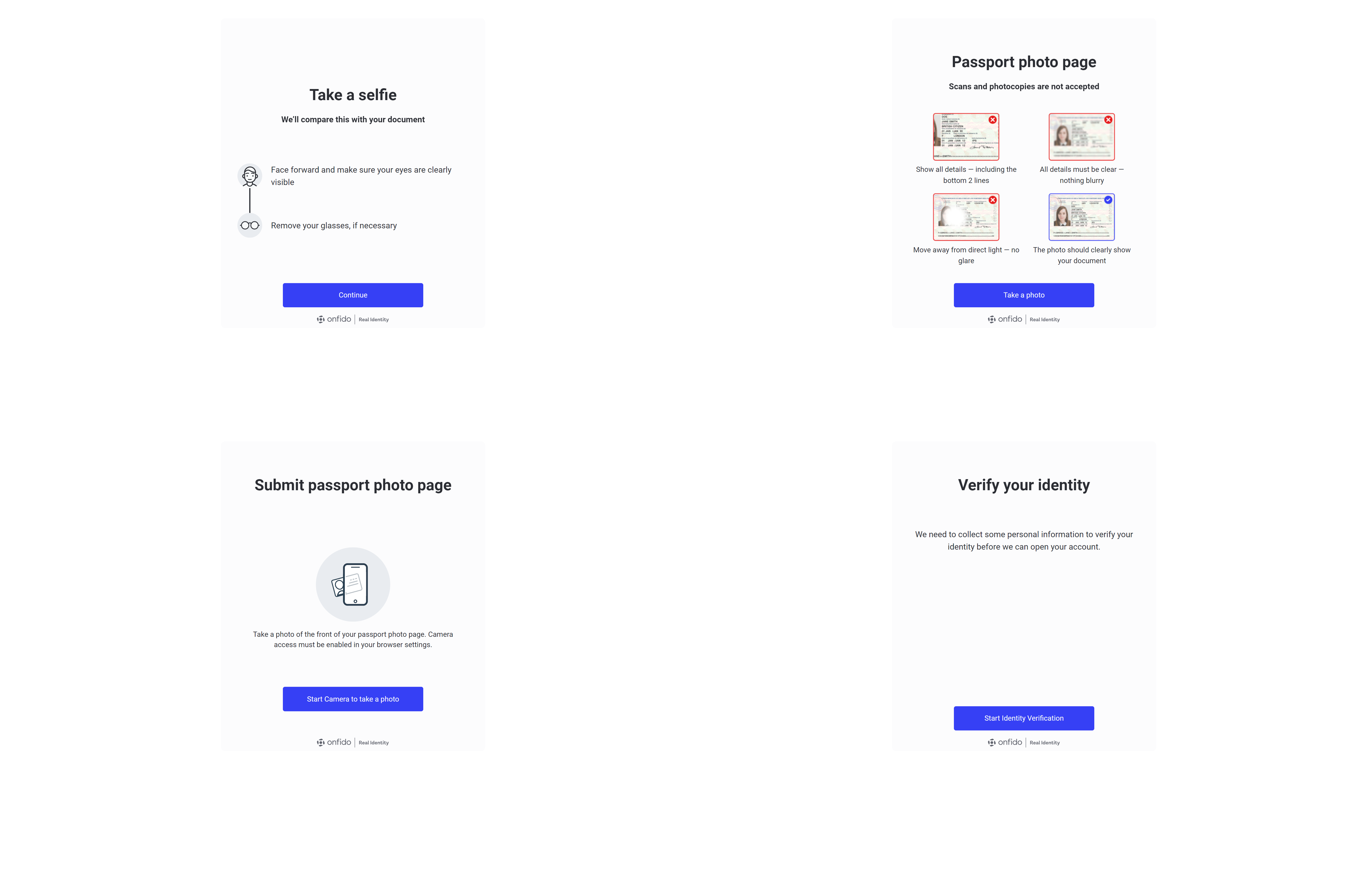
Old design without modal (v1.0)
In the mobile view, the content is designed with a fixed height and is non-responsive, which leaves a white space at the bottom of the screen. This design choice may affect the user experience on mobile devices. On the desktop view, a light grey container is placed at the centre of the screen, set against a white background, creating a minimalist aesthetic. Generally, there is no back button available in both views, which might require users to rely on other navigation methods. This design is consistent across both mobile and desktop platforms.
Mobile view
Desktop view
Updated 3 months ago