UI Customisation
Note when using Bootstrap libraries
We have seen some CSS bootstrap libraries cause issues with the display of the consent dialogue on iOS devices.
This can be resolved by adding an override for
z-indexproperty in the.ff-form-overlayclass.
Sizing the UI in the Form module
Since v3.6 (check Version Log), the height and width configuration takes a special value “AUTO”, which mimics the default behavior for HTML block elements.
The height will adapt to the Form’s contents, which are variable, and the width will extend to 100% of the parent’s width.
Other values for height and width configuration, available from early versions, are:
- “FULL”, which uses the
innerHeightandinnerWidthof the viewport - “yy%”, which makes the UI size as a percentage of its container
- “yypx”, which makes the UI size fixed in pixels
You may use any combination of values for width and height. For a decent user experience, we recommend the minimum dimensions to be 380px wide and 500px tall.
How to define the UI size via CSS or JavaScript
Changing the Form configuration will cause it to reload, restarting the flow. If you need more dynamic sizing, perhaps to make it more responsive, you can set width and height to “100%” and either:
- resize its container, or
- override the width and height using CSS with important rules or JavaScript directly to the `
ff-onboarding-widgetelement.
Note on configuring width and height
Configuring the width and height with “100%” is mandatory for this use case, so the inner elements are aware they need to adapt to external sizing rules.
AUTO height with max-height CSS rules
Configuring height as AUTO will always allow the Form UI to grow with its contents. If you wish to limit that growth with max-height styling rule, you’ll notice that although the root element ff-onboarding-widget obeys that constraint, the contents don’t. They will overflow the root element, just like a div with variable contents would.
If you come across this situation, you may also add overflow: scroll to the styling so the content won’t overflow anymore and users can still scroll and see the rest of the contents.
Possible issues with overflow: scroll workaround
overflow: scroll workaroundTwo problems may arise with this workaround:
- The “Next” buttons at the bottom of most pages won’t be always visible and might be hidden under the scroll region.
- Dropdowns might be hidden under the scroll region and depending on the absolute size of the Smart UI, the dropdowns might create a temporary scroll effect, which in general doesn’t look very good.
Custom CSS
v3+
Visit Migrating v2 to v3
v2 only
Since v2.3.0, the shadow DOM was removed and external styles can now target elements within <ff-onboarding-widget>. This means it's now possible to customize it to look like it belongs to the host platform.
While that is an advantage overall, it also means some unintentional styles may be injected into the UI and have undesirable effects. Most websites and web applications don't use generic element selectors as they don't target anything specific, but let us know if your platform requires a version that is isolated using the shadow DOM.
CSS Selectors
Selectors throughout the Form UI are intended to facilitate overriding their styles, but we're open to suggestions and requests on how to make style override simpler. Here is a quick guide on how to override styles:
-
The font family for the UI can be changed targeting the root
#ff-onboarding-widget. Any font family available on the page can be used. The default styling expects the following font weights and styles, where weights fallback to the closest available one:- 300, Regular
- 300, Italic
- 400, Regular
- 400, Italic
- 700, Regular
-
Selectors are prefixed with
ff-, to avoid targeting external elements -
Page titles can be targeted with
.ff-title -
Page subtitles can be targeted with
.ff-subtitle -
Every page has multiple levels of containers, which can be used to target specific views. They are named View, Form, and Input, but that only refers to how they access data internally and has no meaning to how they should be displayed or how they behave externally, so you may disregard that naming.
In the list below, an item in the form [class &&] followed by an indented inner list means that the class is appended with one of the following listed classes. Otherwise, indented inner lists mean they are contained within the parent class. Elements usually have multiple intermediary containers not mentioned here, so avoid using the direct child selector (>).
1. .ff-welcome-view
2. .ff-initial-data-view
1. .ff-document-form
1. .ff-document-type
2. [.ff-document-input &&]
1. .ff-passport-input
2. .ff-medicare-input
3. .ff-licence-inputs-container
2. .ff-personal-details-form
1. .ff-fullname-input
2. .ff-dob-input
3. .ff-address-input
1. .ff-address-autocomplete
2. .ff-address-manual-input
3. .ff-details-review
1. .ff-document-review-input
2. .ff-applicant-review-input
3. [.ff-the-input &&], which is the specific form being reviewed, shown after clicking the pen to edit that specific field. It will also have one of the following classes that have been shown before in .ff-initial-data-view
1. [.ff-document-input && specific document type] same as .ff-document-input above
2. .ff-fullname-input
3. .ff-dob-input
4. .ff-address-manual-input
4. .ff-no-match, which contain revision for personal details
1. .ff-warning-no-match
2. .ff-personal-details-form and its children, same as above
5. .ff-partial-match, which contain revision for document details
1. .ff-warning-partial-match
2. .ff-review-document and same children as .ff-details-review, but only for documents
3. .ff-document-form, same as .ff-document-form above
6. .ff-warning-success
7. .ff-failure-view
-
Most basic elements come from our external component library and for that reason they have stronger targeted styles. They are elements such as Form Inputs, Progress Bar, Dropdowns, Check Boxes, Buttons and What we call Go Ahead Buttons, which are Buttons with an Icon, Label Text, Hint text and an Arrow icon pointing to the right. They can still be targeted but might require greater specificity, including the use of !important rules. Their inner structure is the following.
- Button
- button.ff-basic-button, which is a simple button element
- Go Ahead Button
- button.ff-goahead-button
- .ff-icon, the custom icon
- .ff-label
- .ff-main-label, title in bold
- .ff-hint-label, small italic hint below the title
- .ff-arrow, the arrow icon
- Progress Bar
- .ff-progress-bar, grey container
2. .ff-progress, the action progress, in blue
- .ff-progress-bar, grey container
- Check Box
- .ff-the-tick
- .ff-icon
- .ff-label, all text associated with the check box
- .ff-the-tick
- SelectOption (dropdowns that might also be displayed as a full spread list of options for better UX on small screens)
- .ff-select-option, when it's a regular dropdown is just a wrapper for a third party library
- .ff-the-select-box, the third party element
- .ff-select-option.ff-spread, in case the options list is spread on the screen instead of a dropdown, which makes it a sequence of ul li
- .ff-select-option-filter, the filter text input that might be present or not, based on configuration. See details in Generic Input
- ul.ff-select-option-options, the actual options list
- li.ff-select-option-label, some spread lists might have a first static list item that is simply a label for the list
- li, all the option list items
- .ff-select-option, when it's a regular dropdown is just a wrapper for a third party library
- Generic Input, the basic inputs such as text and number input
- .ff-generic-input
- .ff-label, contains the label text and might contain other elements
- input, the basic native Html input element
- .ff-generic-input
- Button
-
Regarding the disabled state
- Button and Go Ahead Button have a disabled state that can be targeted with the attribute selector [disabled]
- Generic Input will have .ff-disabled in its root .ff-generic-input element, and [disabled] in the native input element
- Select Option will contain .ff-disabled in its root
-
Regarding the focused state
- Being a wrapper for a native Html input, the Generic Input element:focus state can be targeted directly .ff-generic-input input:focus, to change the default border surrounding it
-
Other states will still be made available
Adding styles using JavaScript
It's not necessary to include stylesheets in a traditional manner. Styles injected via bundler's such as webpack will work without any issues. Another way is to inject them manually:
var style = document.createElement('style');
style.innerHTML = `
  #ff-onboarding-widget {
    font-family: "Comic Sans MS"
  }
`;
document.head.appendChild(style);
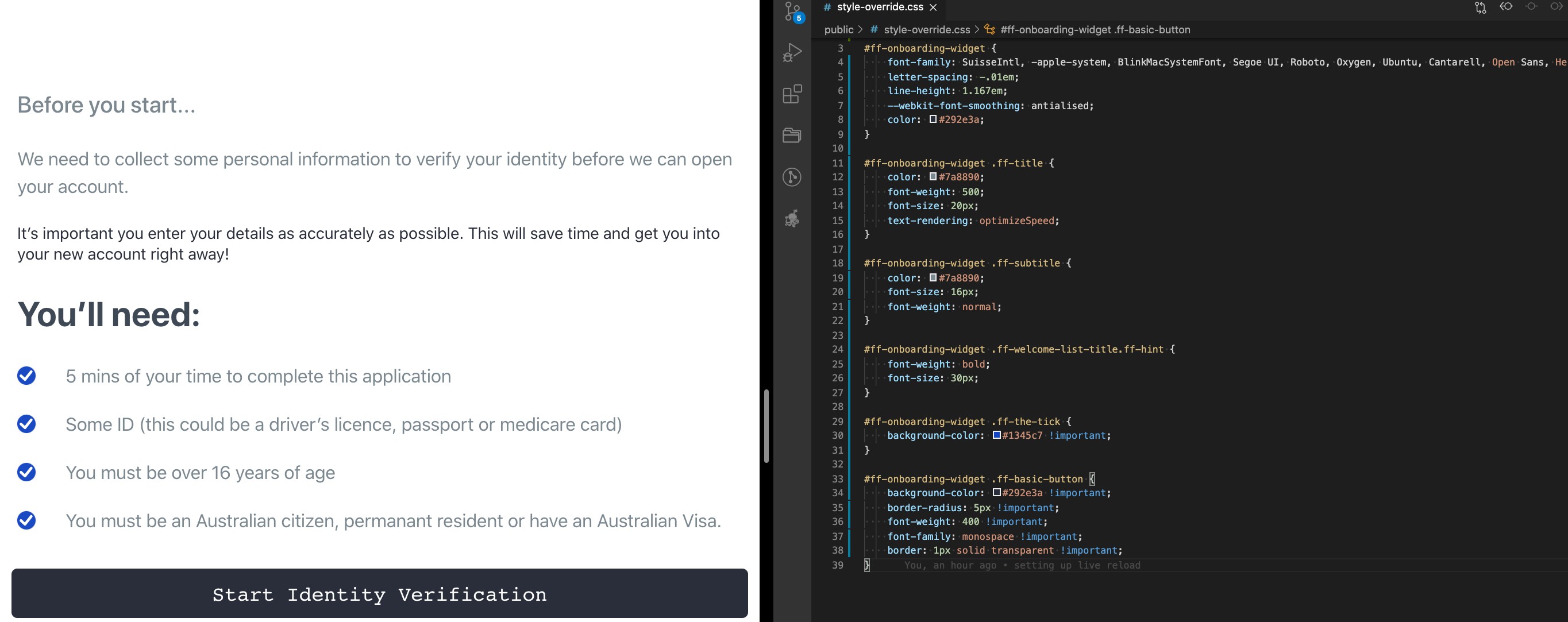
Custom Styles - Examples

Custom Styles
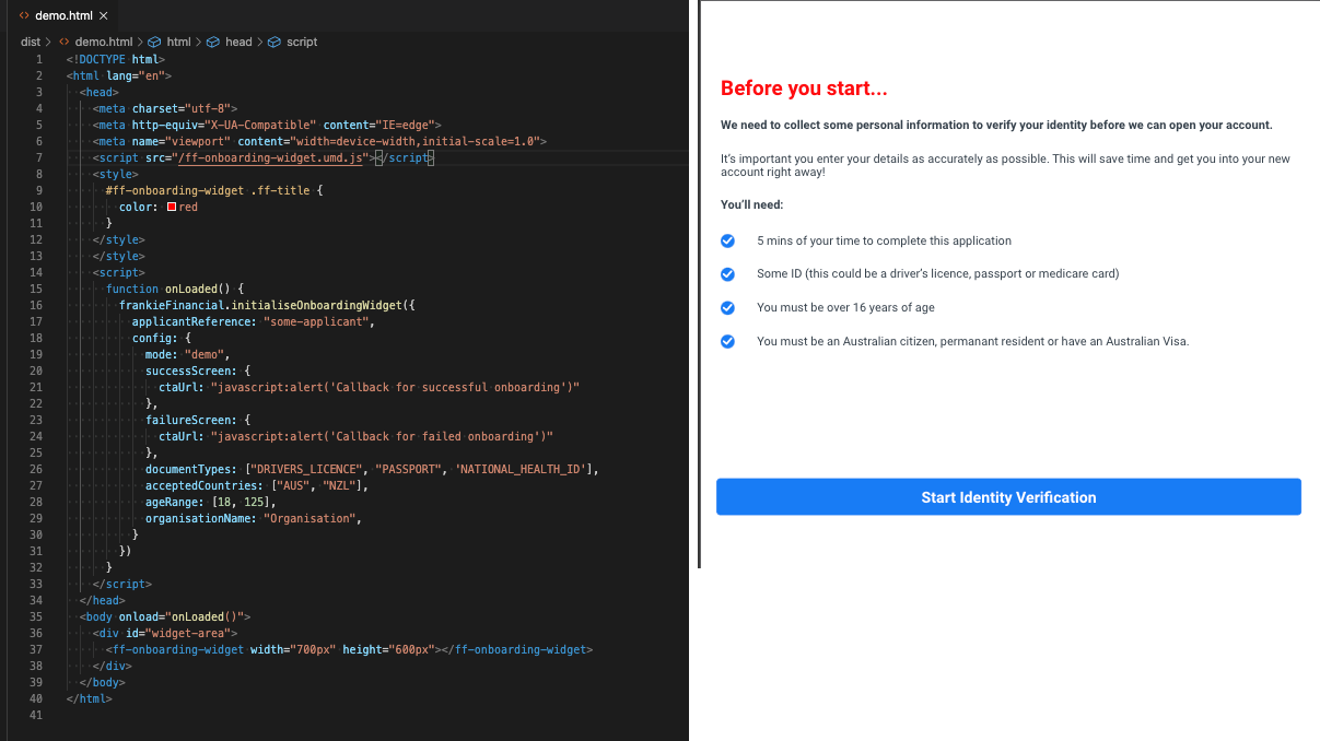
Initialization in script tag and custom styles
This is in demo mode, so ff-onboarding-widget tag is missing the token in the ff attribute.

Basic Initialization

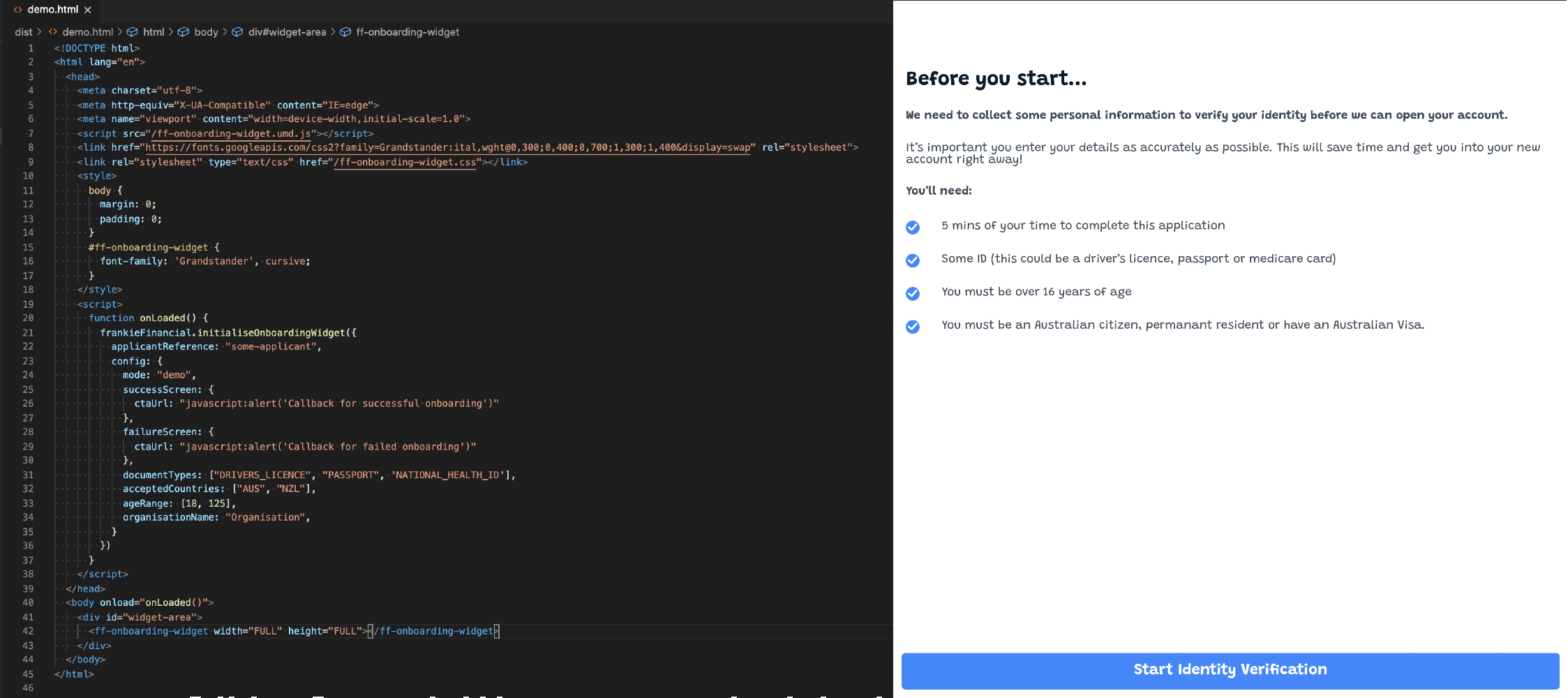
Changing the font

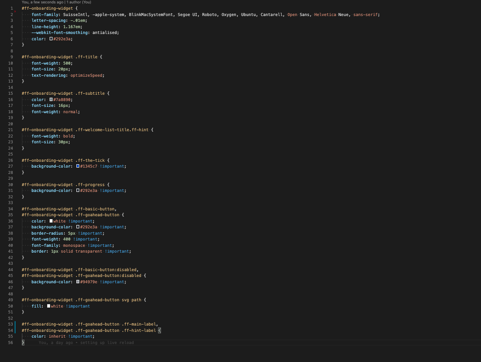
Custom Style Example
Updated about 1 month ago
